To celebrate the Carnival holiday, the Pandora Brazil team wanted a custom 360 campaign to highlight their market’s one of a kind Carnival-themed charms.
I worked with the Pandora Brand team, product stylist, and our agency partner to develop the “Vibrant, Like You” campaign. From initial creative concepts to photoshoot & retouching to production, I oversaw the implementation of this campaign across print, in-store, digital, and social channels.
Art Direction & Graphic Design: Kristen Yeung
Agency Partner: Triptent
Photography: Thomas C. Card
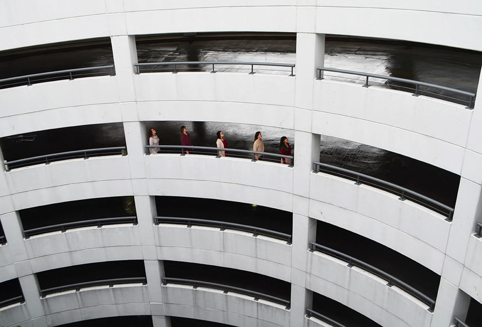
The Collective is a collaborative ensemble of professional dancers and choreographers based in Baltimore. The choreography in their Spring 2016 show “The Art of Movement” was inspired by everyday movement and non-dance physicality. This photoshoot explored athletic movement on dancers’ bodies.
Art Direction & Graphic Design: Kristen Yeung
Photography: Candice Michelle Photography
Dancers: Polly Hurlburt and Adrienne Kraus-Latanishen
[solidcore] wanted to create a fun Valentine’s Day activation that humanized their reformer machine, [sweatlana]. To do so, we leaned into the sweet nostalgia of old school love letters, snail mail, and DIY Valentine’s cards and doodles.
Easily addressed and handed to a student or sneakily slipped into their locker for a sweet surprise, [solidcore]’s post-class postcards were designed to look like literal love letters. Hand-drawn/handwritten elements and punny copy helped to humanize sweatlana and 20 varieties in messaging made the notes feel personal.
By incorporating carnation pink with brand colors & type treatments, the creative felt playful and timely, but still on-brand. The activation look & feel was also carried into the digital experience through email and social.
Creative Direction, Design, & Copywriting: Kristen Yeung
Yarrow Floral Co. is a Baltimore-based, woman-owned floral design studio. They specialize in a lush, romantic style with a focus on seasonality & sustainability.
In designing their branding and business cards, I opted for juicy tones, a stylized typeface, and rounded corners to complement their refined but youthful, fun & fresh aesthetic.
In Spring 2018, Pandora launched Pandora Shine, a new collection of 18k gold-plated sterling silver jewelry. We wanted to launch this new metal offering in a big way.
Our main objectives:
- to emphasize gold & luxury
- to communicate fit with the brand & that the collection is unique to Pandora
- to present the collection as an affordable luxury option that is premium priced, but worth it
As creative lead for the spring campaign, I oversaw all creative for this launch. Special print pieces like mailers & scratch-to-reveal gold catalogs showed off the new jewelry in the collection. I concepted store windows and in-store displays that communicated gold in an eye-catching way and tied to the bee-themed jewelry in the collection. In consumer testing, it outperformed all other options in our key objectives. I also art directed Shine 101, a series of training videos to educate & excite our store associates about the new collection and how to style it.
Art Direction & Graphic Design: Kristen Yeung
Agency Partner: Triptent
Transcending cultures, borders, and stereotypes, and bringing people together with the power of her music, Shakira is unafraid of showing the world who she is and what she stands for. Through a yearlong partnership, Pandora and Shakira encouraged women to celebrate who they are and use personal style as a form of self-expression and confidence.
As in-house art director for this project, I collaborated with the Pandora Brand team, our agency partner, and Shakira’s team to bring the partnership to life across all channels. We created videos, style quizzes, a social media contest, in-store materials, shoppable ecommerce pages, digital ads, and social media featuring various images & jewelry stylings that expressed different facets of Shakira’s identity.
Art Direction: Kristen Yeung
Agency Partner: Mindshare
The Collective is a collaborative ensemble of professional dancers and choreographers based in Baltimore. Their Spring 2020 show “furthermore, also, too” examined the theme of transitions, as many company members identified themselves to be in the process of change.
We concepted, planned, and directed a photoshoot to visually explore these themes of support, anticipation, resistance, freedom, sadness, and transition. The resulting images were used in promotional materials for the show.
Creative Concept & Art Direction: Kristen Yeung & Lynne Price
Graphic Design: Kristen Yeung
Photography: Lynne Price
Dancers: Jillie Drutz, Willow Pinkerton, Nina Pongratz, Lindsay Sanders, Kristen Yeung
In 2022, National University rebranded and launched the Supporting the Whole You campaign. In a heavily saturated higher education market, the rebrand visually distinguishes NU from its competitors. NU is the one online university that takes a holistic approach to student well-being through a supportive ecosystem that measures success financially, academically, socially and emotionally, as well as through family life and career.
I worked with NU’s creative directors to apply the new brand across all channels, internally and externally.
Creative Director: Joseph Gerard Seaman
Associate Creative Director: Toby Riley
Graphic Design: Kristen Yeung
Agency Partner: WONGDOODY
The Collective is a collaborative ensemble of professional dancers and choreographers based in Baltimore. Operating like a co-op, company members share responsibilities and each artist’s individual voice is valued.
I created a brand identity for The Collective that captures a sense of rhythm, movement, and play reflective of the work the company makes. Many different visual elements and colors come together to create a harmonious whole.
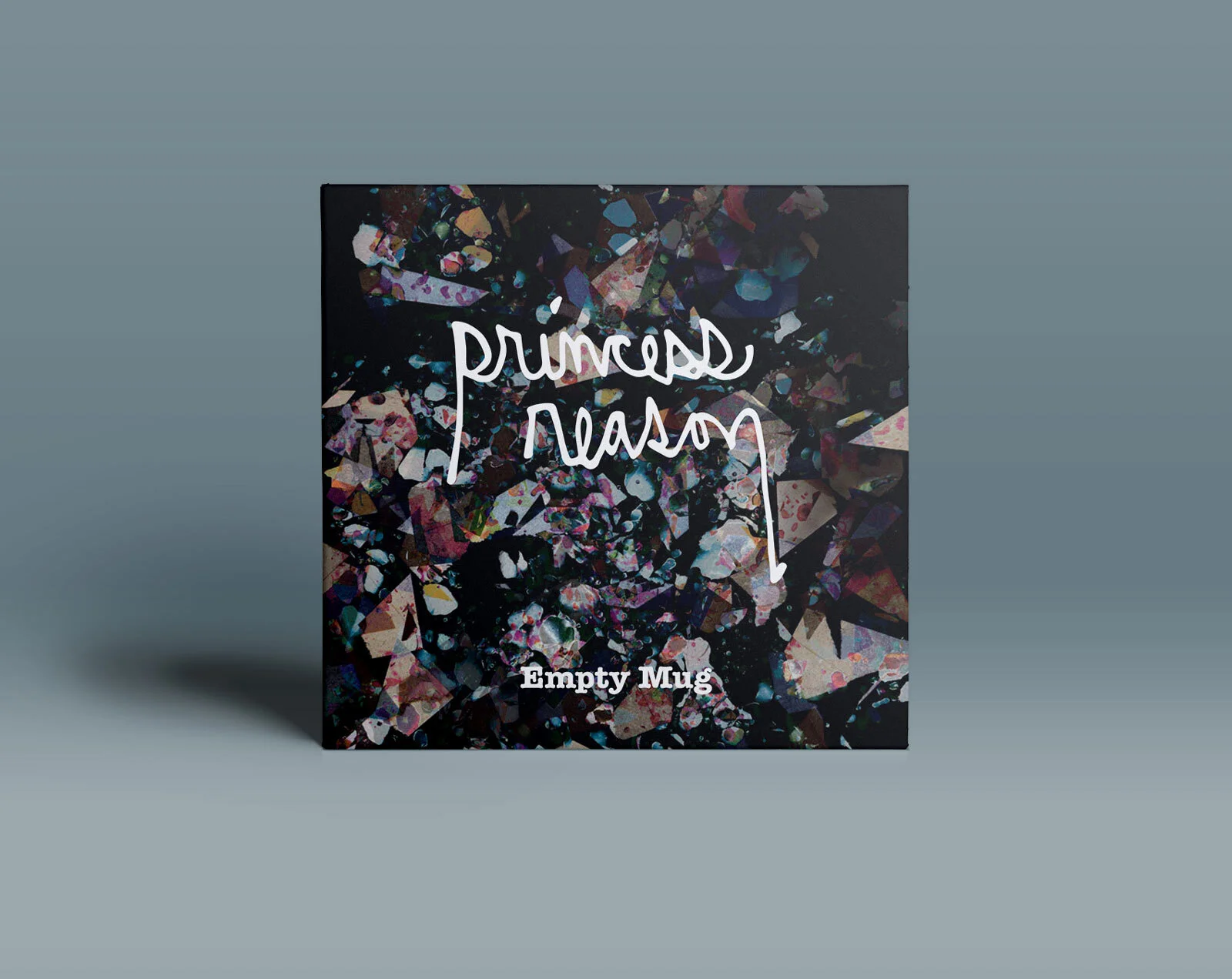
Princess Reason is a solo indie band based in Baltimore.
Using a scanner, ziplock bags, jelly, cut-up paper, and Photoshop, I created this album artwork for the release of their new exclusive ambient track "Empty Mug" on Gold Flake Paint's Digital Singles Club, "Beautiful Confusion."
For International Women’s Day 2021, National University did not want to be yet another brand simply using the day for self promotion. Instead, we decided to take the opportunity to highlight some amazing nonprofit organizations working to support women around the world. In addition to donating to these organizations, we created a video spotlighting them on our social channels.
Graphic Design: Kristen Yeung
Video Editing: Alex Frey
Copywriting: Coco Jeannine
I was tasked by the Pandora HR team with developing a creative strategy & visual identity for an employee engagement program. This strategy was used for internal communication & recognition to encourage community building and cultivate a cultural identity within the organization.
Although this was not a consumer-facing campaign, Pandora’s consumer messaging is powerful. It’s a celebration of self-expression. I wanted to bring that energy in-house.
Later on, HR developed a corporate social responsibility program that could be adapted to each market across the Pandora Americas region. I created a consistent communication strategy to present the program to employees and tie it to the overall Team Shine program.
Art Direction: Kristen Yeung
Agency Partner: Triptent
Copywriting: Triptent & Kristen Yeung
I designed and illustrated organic social media stills and videos for various National University System affiliates, including Northcentral University, National Education Partners, National University Virtual High School, and the education nonprofits Inspire Teaching & Learning and Harmony SEL. These were created in partnership with the Video and Organic Social teams.
Art Direction & Graphic Design: Kristen Yeung
Illustration: Kristen Yeung
Video & Animation: Brady Ferdig, Alex Frey, and Alberto Garcia
The Healing Path is a woman-owned massage and wellness company that comes to you. A journey toward self care, healing, and peace without the hassle of leaving your home.
This branding identity harkens back to the owner’s country roots. She wanted branding that captured the refreshing feeling of a breath of fresh air and the relaxation of driving a winding country road. In addition to communicating a peaceful & safe space, I sought to design an identity that would stand out against competitor branding, which is often very soft and light in color.
Pandora launched the DO campaign in Autumn 2017. To generate excitement internally, we created a Pandora DO Launch Week to engage employees in the new campaign.
I partnered with the Director of Brand Marketing & Event Coordinator to plan the week and then designed all of the graphic elements, working closely with third party vendors to manage production.
The office was decorated with new campaign signage. Each day of the week featured an activity and delightful treat, then the week culminated in an office party celebrating the launch.
Creative Direction, Design & Production: Kristen Yeung
Event Planning: Brooke Benvenuto
Photography: Lindsay Soloman
Fabric and wallpaper textiles digitally printed at Danmarks Designskole at The Royal Danish Academy of Fine Arts, School of Design. They were presented at Copenhagen's 2012 Kulturnatten (Culture Night).
These textiles were inspired by Rorschach inkblots and symmetrical stone cuts at the Hagia Sophia that I saw while traveling in Istanbul. The initial elements of the patterns were made by dabbing ink & paint onto paper then folding it in half, and were later digitally manipulated to create step and repeat patterns. I wanted to honor the importance of chance in the creative process, as well as complement the precision of digital editing & printing technology with a handmade aesthetic.
SmartCEO was a business multimedia platform seeking to educate and inspire business leaders through events, web, and a magazine.
In addition to creating graphics for the events division, I designed covers and feature stories for four issues of SmartCEO magazine per month, reaching the Baltimore, New York, Philadelphia, and Washington DC markets. For three months, I served as Art Director, working with photographers to quickly scope locations and directing photoshoots with CEOs.
Art Direction: Erica Wood & Kristen Yeung
Graphic Design: Kristen Yeung
Photography: Rachel Smith & Mindy Best
In Fall 2012, the University of Maryland introduced composting to campus. As a graphic designer at the UMD Office of Sustainability, in partnership with the University Dining Services and Facilities Management teams, I helped to rebrand campus waste management initiatives.
We developed branding that was used in posters, banners, signage, vinyl decals, and button pins across campus. Our goal: to create a consistent visual identity across all print & experiential marketing to educate the student body about the new changes.
Creative Direction: Fran Mastry
Graphic Design: Fran Mastry & Kristen Yeung
After the 2016 election, some folks wore safety pins to show solidarity and offer safety to one another. This apparel was created to boldly ensure your support would not be missed.
I hand-painted and digitized the safety pin illustration and used it to create T-shirts, sweatshirts, and tank tops, which were available for purchase via Threadless. All profits were donated to Planned Parenthood and the ACLU.
Founded in San Diego in 1981, Kashi is a maker of whole grain cereals and other plant-based foods made with simple, whole ingredients. Their brand values natural foods, healthy lifestyles, and sustainable practices with a target demographic of health-minded consumers ages 25-34.
For this spec project, I redesigned the packaging for Kashi’s Strawberry Fields cereal with a different target demographic: young children ages 3-10. I explored how a different packaging aesthetic - bright colors, fun characters, games - could catch the eye of a kid in the grocery store and entice them to choose a healthy cereal.
Eddy Homes is a luxury development company building custom homes in the Greater Pittsburgh area. Since 1971, their mission has been to build homes where dreams are realized and families flourish. They have built seven different communities catered to different needs and buyers - single families, patio homes, custom estates, couples 55+, etc.
To help advertise each neighborhood, I designed flexible desktop & mobile email templates with images that could be easily changed and content blocks that could be easily rearranged. Though each email layout is specific to a community, they all maintain a cohesive and clean aesthetic aligned to the Eddy Homes brand.
HandReach is a nonprofit foundation that provides care and rehabilitation for child burn & trauma survivors. HandReach is dedicated to developing a sustainable network around the world committed to the full physical and emotional recovery of child trauma survivors.
I designed, produced, and mailed their 2013 year-end mailer: a mailable mini first aid kit. Inside, the kit included bandages, information on the organization, stories of child survivors, and directions to donate. Since imagery of burn survivors can be jarring, the front of the kit featured a tactile bandage and image of a teddy bear to elicit an emotional response.
Rather than creating a paper mailer that could get lost in the deluge of year-end mailers or go straight into the recycling, this first aid kit could be kept and used. It would serve as a continual reminder of HandReach’s mission and hopefully encourage multiple donations over a longer period of time.
Ejji Ramen is a ramen bar in Baltimore serving flavorful, upscale food with a down home vibe. Run by an uncle & nephew team, all dishes are made from scratch and infuse the owners’ Malaysian heritage into a menu of home-cooked Asian comfort food. It’s a blend of warmth & comfort with adventure & exploration - a place where customers feel welcome and are encouraged to create their own bowls and try new flavors.
I developed branding and menus to reflect Ejji’s playful nature. Main menus laid out clear step by step instructions to encourage customers to “be ejji” and create their own bowls or “be bold” and try something new. Children’s menus featured games and origami instructions. Even line weights and the encircled logo variation serve as a subtle homage to the owners’ Asian heritage - tradition with a modern twist.


![[solidcore]_ValentinesDay_Postcard_GIF2-Cover.gif](https://images.squarespace-cdn.com/content/v1/56a675a78b38d491f169238e/1676421515772-CI6Z07IRHIJF3837BNWU/%5Bsolidcore%5D_ValentinesDay_Postcard_GIF2-Cover.gif)